
Designing for a Cause: Crafting a Seamless User Experience to Support Edgar and Ivy’s Lifesaving Mission
Website redesign of a local cat sanctuary, Edgar and Ivy’s.
Methods: Competitive Analysis, User Interviews, User Persona, User Flow, Wireframing, Visual Design, Prototyping, User Testing
Role: Sole UX/UI Designer
Project Type: Volunteer
Duration: 1 month (8/2024)
Tools: Figma, Google Suite, Procreate
Background
After rescuing stray kittens and searching for a home to prevent them from being euthanized, I discovered Edgar and Ivy's Cat Sanctuary. Their dedication to saving animals resonated with me deeply, and I was inspired to support their mission. However, upon exploring their current website, I found that it wasn't effectively conveying their message or facilitating user engagement. This inspired me to create a redesigned prototype of their website that would highlight their mission more clearly, helping them garner more support, donations, and volunteers.
The Challenge
The original Edgar and Ivy's website suffered from poor design choices that created friction for users. It had too many fonts, lacked consistent visual elements, and the content was disorganized and overwhelming. New visitors were likely to feel lost, as the most critical information about donation methods, resources, and volunteering was buried or difficult to locate. This negatively impacted the sanctuary’s ability to communicate their mission and increase engagement. See below pictures of the original website.


Problem
From the user’s perspective, the current website lacks effective readability, consistency, accessibility, and organization. These issues make it challenging for users to engage with the website and accomplish their goals—whether that’s adopting a cat, making a donation, or learning more about the organization. Poor readability hinders users from digesting content easily, while inconsistent design elements and disorganized layouts create confusion. The lack of accessibility features excludes a portion of users, resulting in frustration and potential abandonment.
Goal
I aimed to redesign the website by:
retaining all critical information but presenting it in a consistent, clean, and organized manner
incorporating an intuitive tab navigation at the top of the page and a footer with important links
using bold yet accessible colors and fonts that align with the sanctuary’s branding
focusing on creating an emotional connection with users through strong visuals and storytelling, encouraging engagement, volunteering, and donations
improving accessibility, ensuring the website is usable by a diverse audience
Let’s See What a User Thinks of the Current Website…
To better understand the pain points of people visiting Edgar and Ivy’s current website, I conducted a user interview.
Here are a few of the most insightful questions I asked:
-
A: "Why is there too much all at once on the home screen, the side bar navigation has way too many options and I don't know where I should go next."
-
A: "Difficult. Going to the pages made some jerky motions. The only option is to go back is the actual back button on the window. Over time I saw there was in fact a home page button but it was hard to see and doesn't stand out."
-
A: “I would tell them to click the donate button at the top. I wouldn't blame them if they were hesitant because the website itself does not look professional or reliable because of its novice quality. I do think the site has good narratives for the pets they saved but it is not enough for me to ignore how it is presented."
-
A: "No. especially the hovering over the hyperlinks on the nav column the white text blends in with the background so its unreadable. And some of them I don't exactly know where it supposed to go "Wish List" is too vague. Some images are too high res that the load in time is long or blurred at first."
-
A: "No, the website is all over the place that I can't focus on one thing to feel strongly about. Keeping it simple would make me understand their mission more clearly and concisely."
-
A: "It was hard to look through every link especially because they're all the same color and fonts. I'd rather there just be a page where similar info are grouped under that."
-
A: “It has the necessary features right now its the organization and presentation that need the attention.”
-
A: “I do not like it. Uncoordinated fonts, images that don't have margins, too much unnecessary whitespace, text overlapping each other, not a strong color palette everything is just brown.”
-
A: “Way better in grouping, visual, and text readability. Similarities in the same purposes in donating and saving animals but much more impactful because of its stylization. The other website [Edgar and Ivy’s] didn't have consistent quality in images, some seemed to just be from the internet or really fuzzy.”
The main issues identified were difficult navigation and disorganization.
The user mentioned specific issues such as:
that it was hard to find key resources, as well as information about the sanctuary itself
difficulty accomplishing tasks, such as how to surrender a pet, foster, and volunteer, or other ways to donate (like Amazon wish list and Chewy)
how the appearance overall felt unprofessional and deterred them from the sanctuary’s mission
After gathering this feedback, I made clean navigation and clear organization the primary focus of my redesign. as well as accessibility in regards to fonts and colors..
How are ASPCA and PETA Successful?
I conducted competitor analysis of other non-profit animal organizations like ASPCA and PETA.
These organizations:
use bold colors
emotionally impactful imagery of animals
have a streamlined donation processes
have clean, easy-to-digest layouts that prioritize key information
I incorporated these insights into the Edgar and Ivy’s redesign to ensure that important information was front and center, while also evoking empathy from visitors.
Our Potential Users…
I created two user personas based on my research of who the main users of the website are:
potential adopters
supporters looking to donate or volunteer
“As a first-time pet owner, I want quick and easy access to reliable resources and information to ensure I can provide the best care for my new cat.”

“As someone passionate about animals, I want a straightforward donation process and clear information on how to get involved through volunteering. I also want to easily share the organization’s mission with others to inspire more support.”
Lo-Fi Wireframe
After analyzing the existing content, I organized the information into categories to make it easier for users to find what they need. I sketched a simple low-fidelity wireframe in Procreate, to ensure I prioritized information hierarchy. Since this website was a more simple project, I did a simple sketch, however for more complex projects I would rather do a more detailed lo-fi mockup within Figma.
Visual Design
Font:
I went with Chelsea Market as the font choice for banner headings since it was used on their original website and brought a sense of fun to a more serious site. I used Open Sans since it is a legible font that’s great for informative paragraphs and resources.
Color:
I took the red color from their logo to emulate warmth and compassion across their website.
I didn’t use the original brown color from their website since it made things seem too dull and uninteresting.
User Flow


Let’s Turn This Into a “Claw”esome Website!
Hi-Fidelity Prototype:
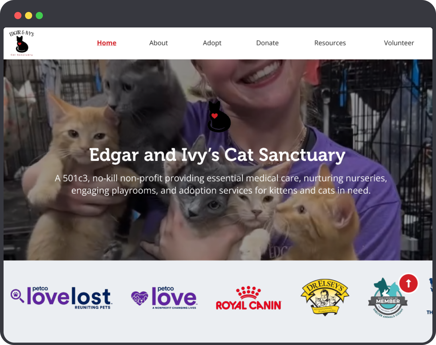
I translated my low-fidelity wireframe into a high-fidelity prototype using Figma. On the homepage, I introduced new features such as:
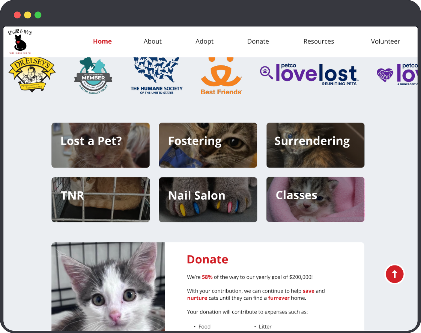
Carousel of Sponsors: A moving carousel on the homepage highlights sponsors, boosting the sanctuary’s credibility and trustworthiness
Background Videos: Videos of staff interacting with cats are displayed on the homepage masthead, helping to create emotional engagement
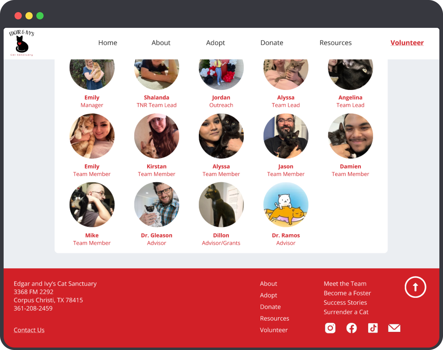
Fixed Navigation Bar: Neatly organizes the sanctuary’s wide array of information (adoption, surrender, donations) into respective categories
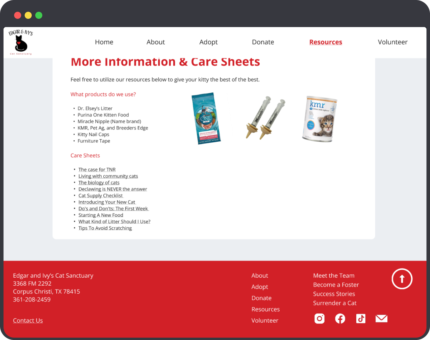
Consistent Footer: Provides easy access to links, social media, and contact info
High-Importance Cards: To emphasize the most important actions for users (such as surrendering a cat, signing up for TNR services, registering for classes, or reporting a lost pet). These standout boxes are designed to draw immediate attention to critical actions that users may want to take right away. This reduces cognitive load by allowing users to quickly locate the most relevant features. I made sure to have them peaking out under the carousel so the user knows to scroll down.
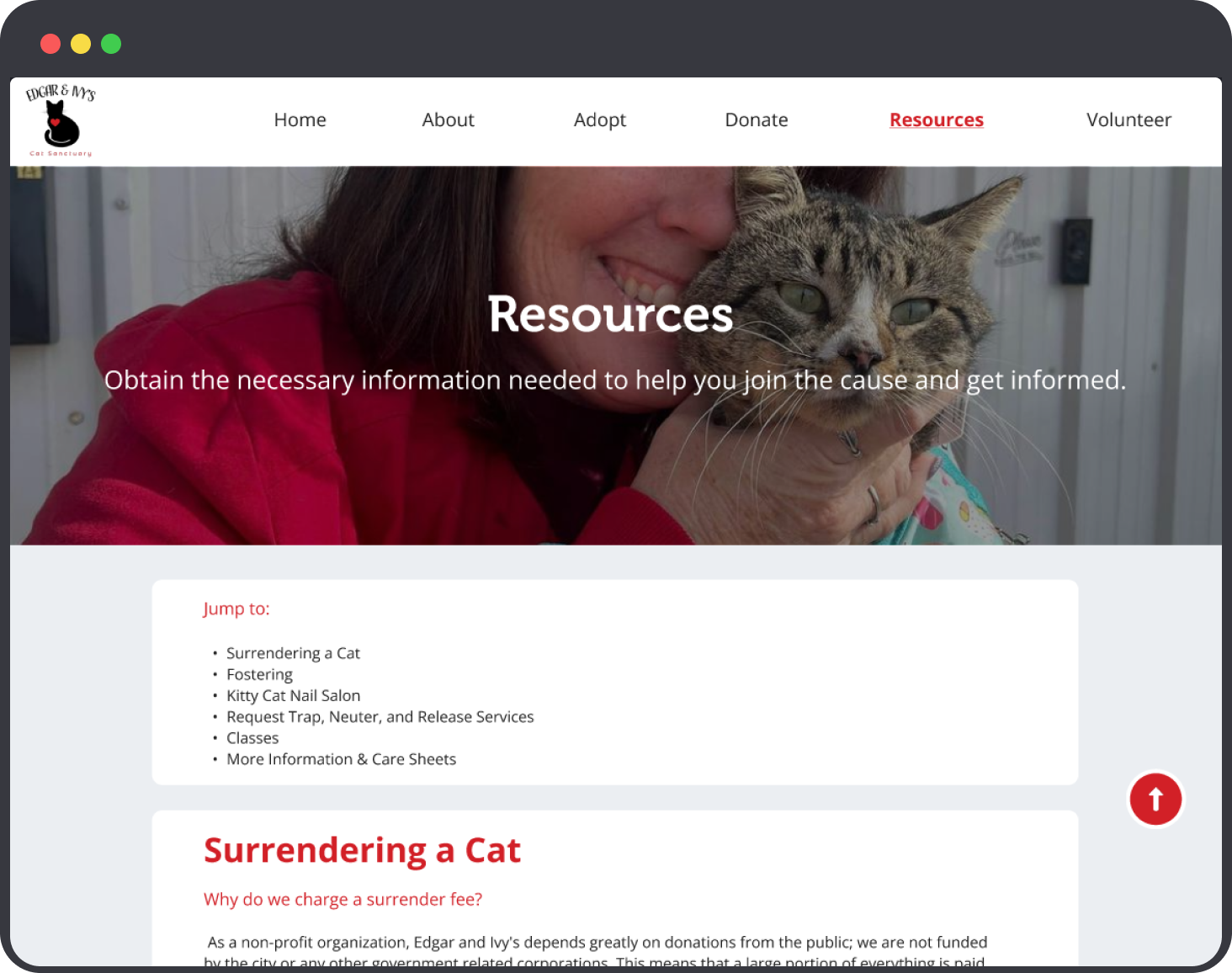
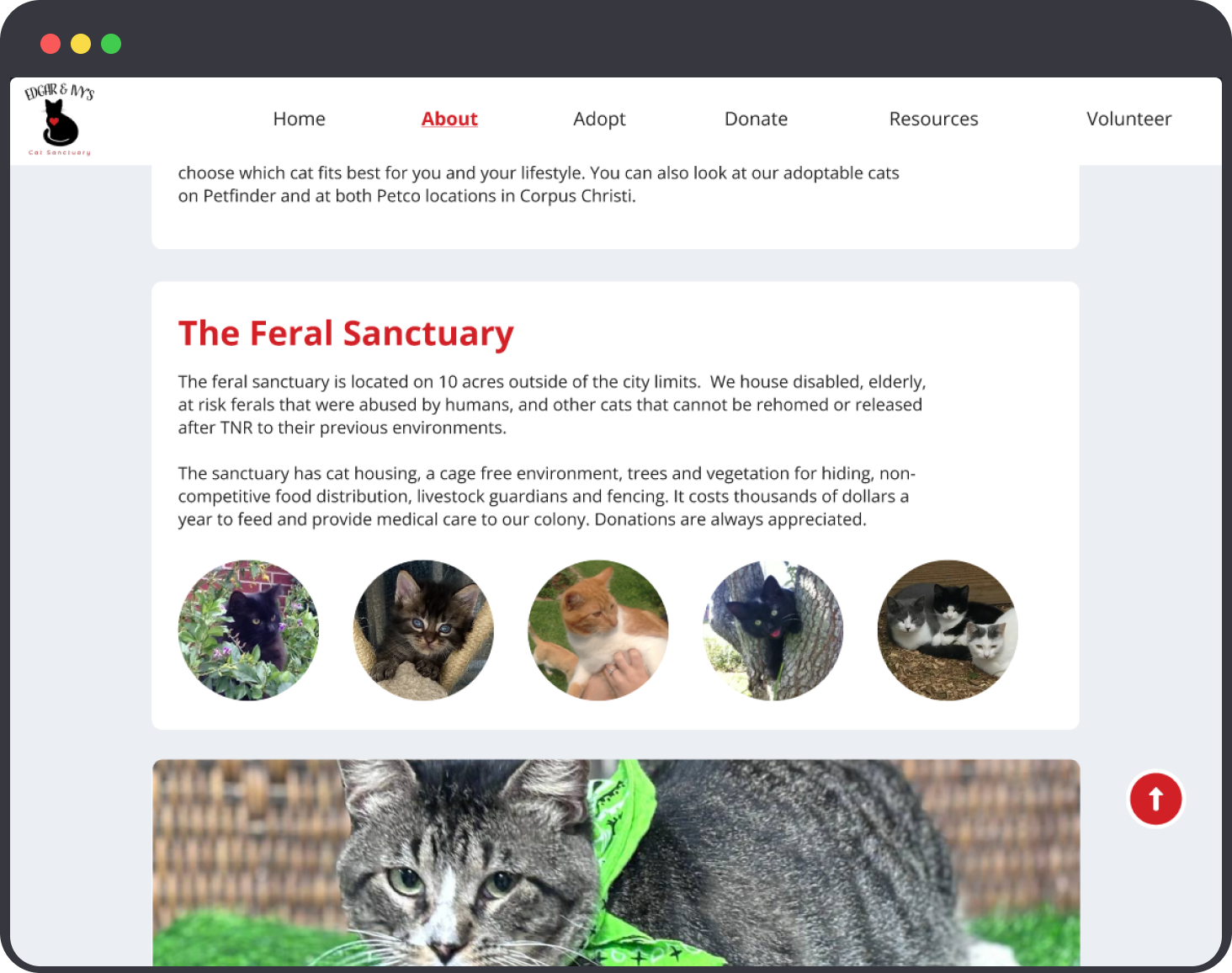
Jump-To Button: On the resource-heavy pages, allowing users to skip directly to the content they’re looking for
Scroll-to-Top Button: For easy navigation on long pages
Development: Auto Carousel
This carousel highlights the sponsors and partners that Edgar and Ivy’s works with, and creates more trust and credibility in their business.
Development: Donation Page
One of the most important improvements was creating a dedicated donation page that consolidates all donation methods in one place (merchandise, Amazon wishlist, PayPal and direct donations). The original website had these options scattered across different sections, making it difficult for users to find.
User Testing
After completing the high-fidelity prototype, I conducted a usability test with another user to gather real feedback.
The user navigated through the redesigned site and provided insights on both the ease of use and any lingering pain points. Her feedback highlighted some minor usability issues, such as the design of the homepage cards, which I then addressed in the my prototype iterations. Specific things she had to say were:
This testing phase was crucial in validating the overall user flow, ensuring that the redesign met the needs of first-time visitors and supporters alike.
Conclusion
I’m proud of how the high-fidelity prototype of the Edgar and Ivy's website turned out. It showcases the sanctuary’s mission clearly, organizes their information in a user-friendly way, and incorporates visual elements that create an emotional connection with visitors.
Challenges I Encountered
Some of the most challenging parts of the redesign included animating the carousel smoothly, selecting appropriate fonts and a color scheme from the original website, as well as deciding how to lay out images. I also wasn’t entirely sure how to go about the volunteer page, since on their website you have to fill out a questionnaire and watch an orientation video (the link to it was broken), so I just made it a three step process. However, I think I successfully overcame these obstacles, and the final design feels clean yet inviting.
Key Takeaways
The main lesson I learned is that simplicity and organization are crucial, especially for a non-profit that relies heavily on user engagement and donations. Having a clear, navigable layout ensures users can easily find the information they need without feeling overwhelmed. Additionally, using empathy-driven design, like photos and videos, can significantly enhance user engagement for cause-based websites.
Anticipated Results
Since this website is not live, here are some results I’d kept in mind and had hoped to see while designing this project:
increase in donations
increase in adoption
decrease in Corpus Christi cat euthanizing
faster task completion
creating more informed users through simple navigation and access to resources
What Would I Do Different?
In the future, I would like to conduct more usability testing to gather feedback from more users and further iterate on the design based on their needs. I also aim to document more of my research process to strengthen my case studies in the future. I also didn’t get around to adding the “success stories” page, since I didn’t have any on file to work with, so I would like to include that in future iterations as well. For my first UX/UI project, I think it turned out great for what it was!
Please see a video of my hi-fi mockup walkthrough below, as well as images of each page of the website.


