Designing a Streamlined Process for The Strand Bookstore Lovers to Discover and Purchase New Finds 📚🔍
Mobile app design for The Strand Bookstore.
Methods: Competitive Analysis, User Interviews, User Surveying, User Flow, Wireframing, Visual Design, Prototyping, User Testing
Role: Sole UX/UI Designer
Project Type: Personal
Duration: 3 months (10/2024-1/2025)
Tools: Figma, Google Suite, Procreate, Storyset (Illustrations)
Background
The Strand Bookstore is one of my favorite places to go to in New York City, and in an increasingly digital world, businesses like it are seeking to expand their reach and enhance customer experiences through mobile technology. While competitors like Barnes & Noble and Goodreads offer online shopping and community features, gaps remain in personalization, usability, and fostering community-driven engagement.
The Strand, known for its iconic NYC locations and vast book inventory, lacks a mobile app to complement its in-store experience. This project aims to bridge that gap by creating a user-friendly app that streamlines book discovery, shopping, and personalized recommendations, while also promoting The Strand's unique value of connecting book lovers.

The Importance of Integrating Digital and In-Person Bookstore Experiences
Using a web browser on mobile to shop can be time consuming, and a lot of sites end up not being responsive. Compared to other booksellers like Barnes and Noble and apps like Goodreads that allow for interaction and credibility within the reviews, The Strand Bookstore lacks a mobile app to help facilitate online orders and streamline the process of purchasing and discovering books, as well as readily accessing features like their membership or coupons.
According to Emarketer.com:
74% of consumers worldwide use retailer apps while they’re shopping in-store
Mobile apps can increase consumer spending
69.9% of consumers say loyalty programs and exclusive offers via mobile app would make them spend more, and 84.2% say it would increase their loyalty to the retailer
Brands that want to encourage purchases via mobile app should focus on making the journey as seamless as possible, prioritizing search and checkout capabilities
By not having a mobile app, The Strand is potentially losing out on sales and loyalty.
How Might We…
How might we create an app that enables seamless shopping?
How might we encourage customer loyalty to The Strand?
How might we foster a sense of literary community?
How might we simplify the book browsing process?
Objective
The Strand mobile app will streamline the book discovery and purchasing process by allowing users to effortlessly search for books, read reviews, and place orders with just a few taps. This will enhance the customer experience by making it faster, more convenient, and personalized, ultimately simplifying the journey from exploration to purchase.
Let’s See What Book Lovers Think…
To better understand the pain points of people who shop for books, I conducted user surveying with 15 people.
Some of the most insightful metrics I received from users included:
90% of users
shop for books online
93% of users
are likely to recommend an independent bookseller’s app if it has good UI
60% of users
would use a mobile app from a retailer they already shop with online
72% of users
have issues finding specific titles, browsing, and discovering new books
60% of users
value the convenience of a mobile app
67% of users
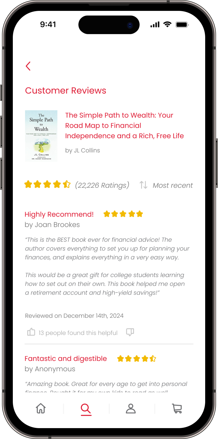
find reviews/ratings the most helpful when purchasing books
Value Proposition Based on User Research Feedback
What Makes Other Book Sellers Successful?
I conducted competitor analysis of other book related companies, like Barnes and Noble, Goodreads, Kinokuniya, and Half Price Books.
Strengths
Barnes & Noble App: Extensive inventory, clear navigation, engaging shopping experience, store locator, easy book purchases, barcode scanner, and strong brand recognition.
Kinokuniya Website: Unique niche offerings, specialized inventory, and cultural focus.
Half Price Books Website: Affordable pricing, user-friendly interface, strong used book inventory, and community emphasis through staff recommendations.
Goodreads Website: Community-driven platform, user reviews, personalized recommendations, and high user engagement.
Weaknesses
Barnes & Noble App: Complicated filtering, lag issues, limited payment methods, poor eBook purchase flow, and lack of personalized recommendations.
Kinokuniya Website: Outdated website design, poor navigation, and unresponsive interface.
Half Price Books Website: Minimal personalization and no integrated review system.
Goodreads Website: Outdated interface, navigation challenges, and lack of unique design identity due to its ties with Amazon.
Gaps & Opportunities
Community Engagement: Enhance community features like reviews or discussions for stronger user loyalty.
Personalized Recommendations: Improve tailored suggestions based on user preferences and behavior.
Design & Usability: Simplify search and filtering, and prioritize intuitive, modern interfaces while keeping The Strand’s brand identity strong.
Who Are Our Users?
I created two user stories based on my research:
“As someone who discovers new reads through social media, I want an app that allows me to quickly purchase books I find, while also providing genuine reviews and ratings, so that I can make informed decisions and buy with confidence.”
“As a busy book lover, I want a streamlined way to search for books and filter out irrelevant results, so that I can find what I’m looking for quickly and easily without getting distracted.”
Lo-Fi Wireframes
Using Mobbin, Dribbble, and my competitor analysis examples for inspiration, I began to design lo-fidelity wireframes to guide me for the hi-fi prototype. In this lo-fi prototype, I played around with the red, gray, and white color scheme that The Strand uses on their website to make sure it is cohesive.
I also made sure to incorporate some of the features mentioned in my user research, such as reviews, personalization, and easy filtering.
Intentional Branding and Aesthetic
Font:
I went with Alesand as the font choice for some of the text since it was the most close to RECTA SMALL CAPS (which is on The Strand’s website) that I could find. I also used Poppins since it is also on their website. Helvetica Thai Bold is used in The Strand’s logo, however I had no use for it in my project.
Color:
I stuck with The Strand’s strong red color and used it throughout the app design to create emphasis in certain areas. The gray tones allowed me to have legible text that tied in with their website’s original colors as well. The yellow and green I added in myself and used sparingly for things like rating stars and adding to wishlists.

Streamlining the App’s User Experience


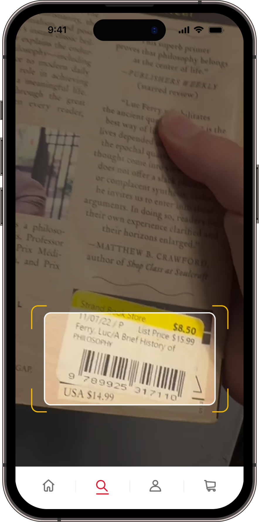
Development: Barcode Scanner
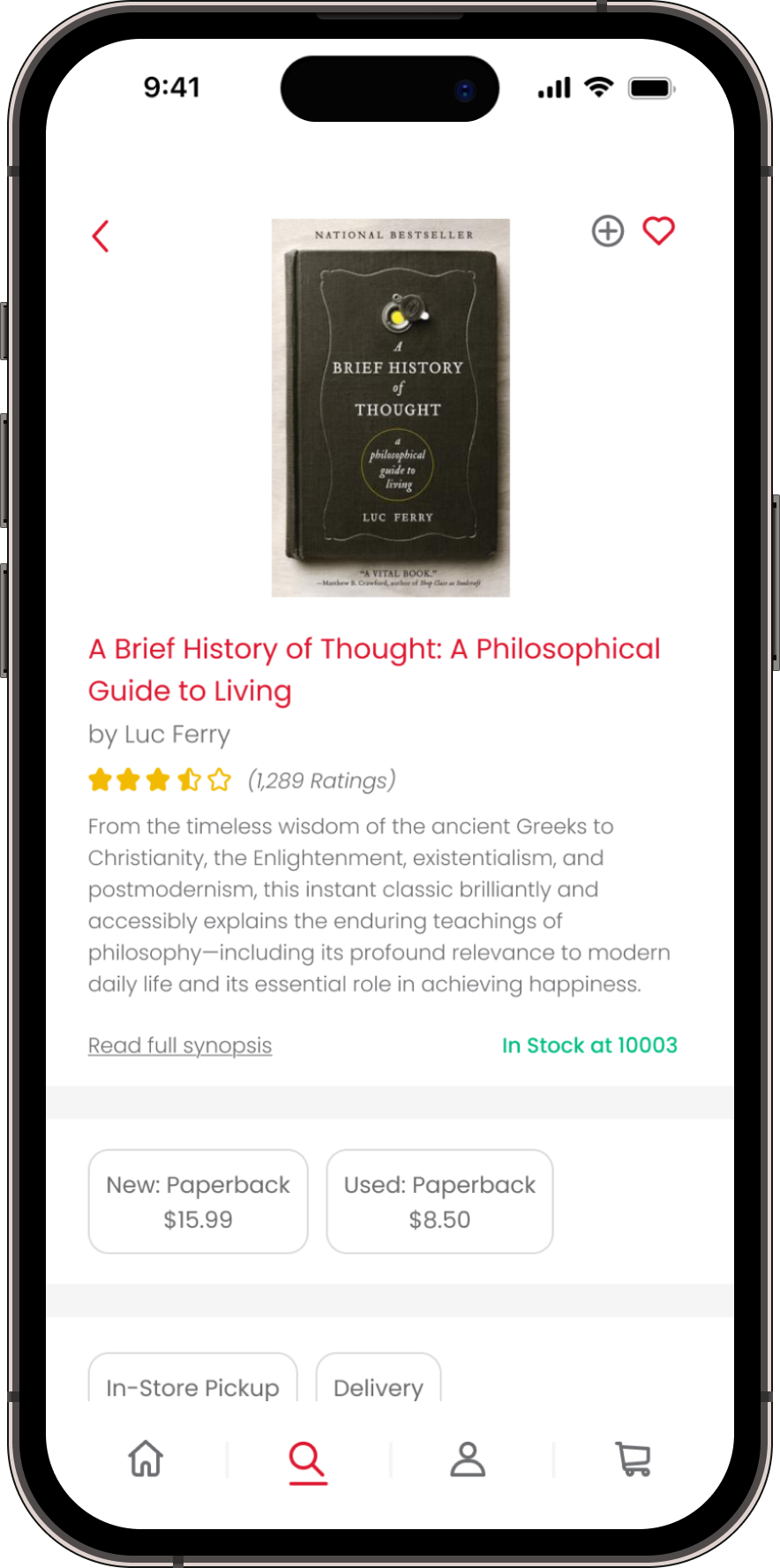
I began implementing features in the hi-fi prototype based on my user surveying and competitor analysis. One of my favorites was this barcode scanner that would easily pull up any book’s page when its barcode is scanned. You can see reviews, product information, and even purchase the book through this method.
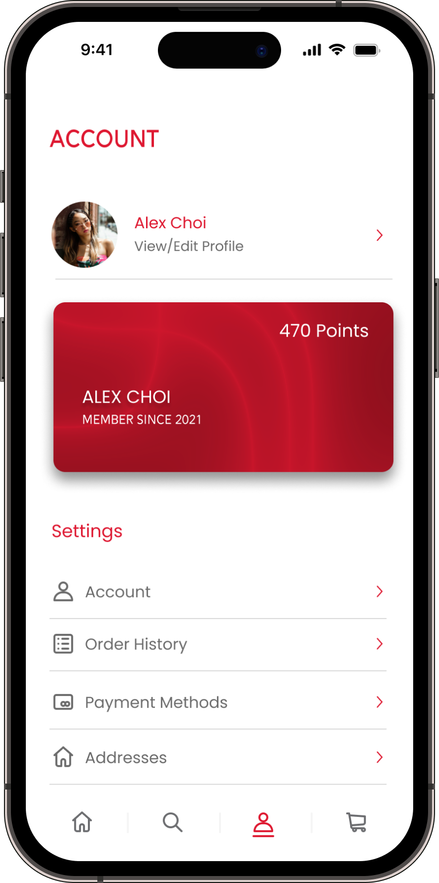
Development: Membership Card
It took a bit of time to get the card flip to work properly! I made this feature so users can easily pull out their membership cards at any Strand store to get their account scanned, and also see if they have any discounts available.
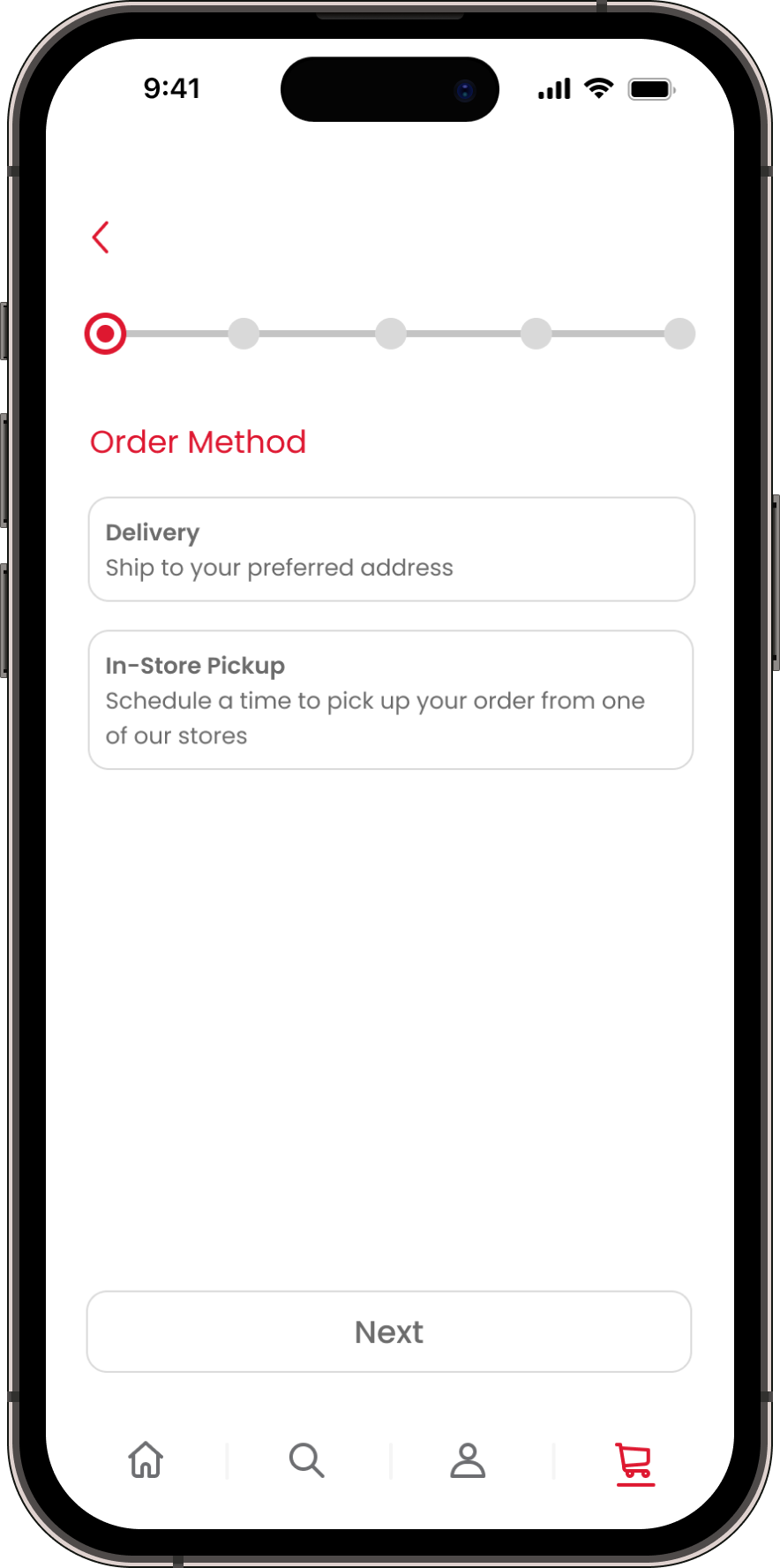
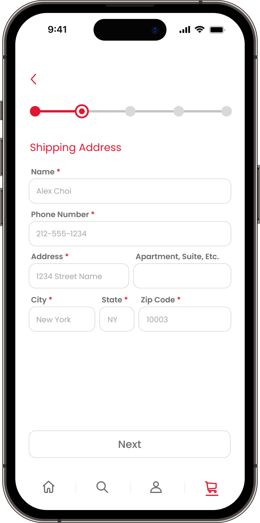
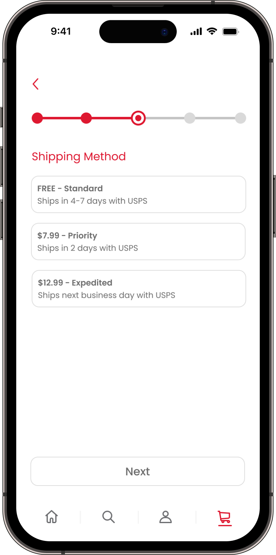
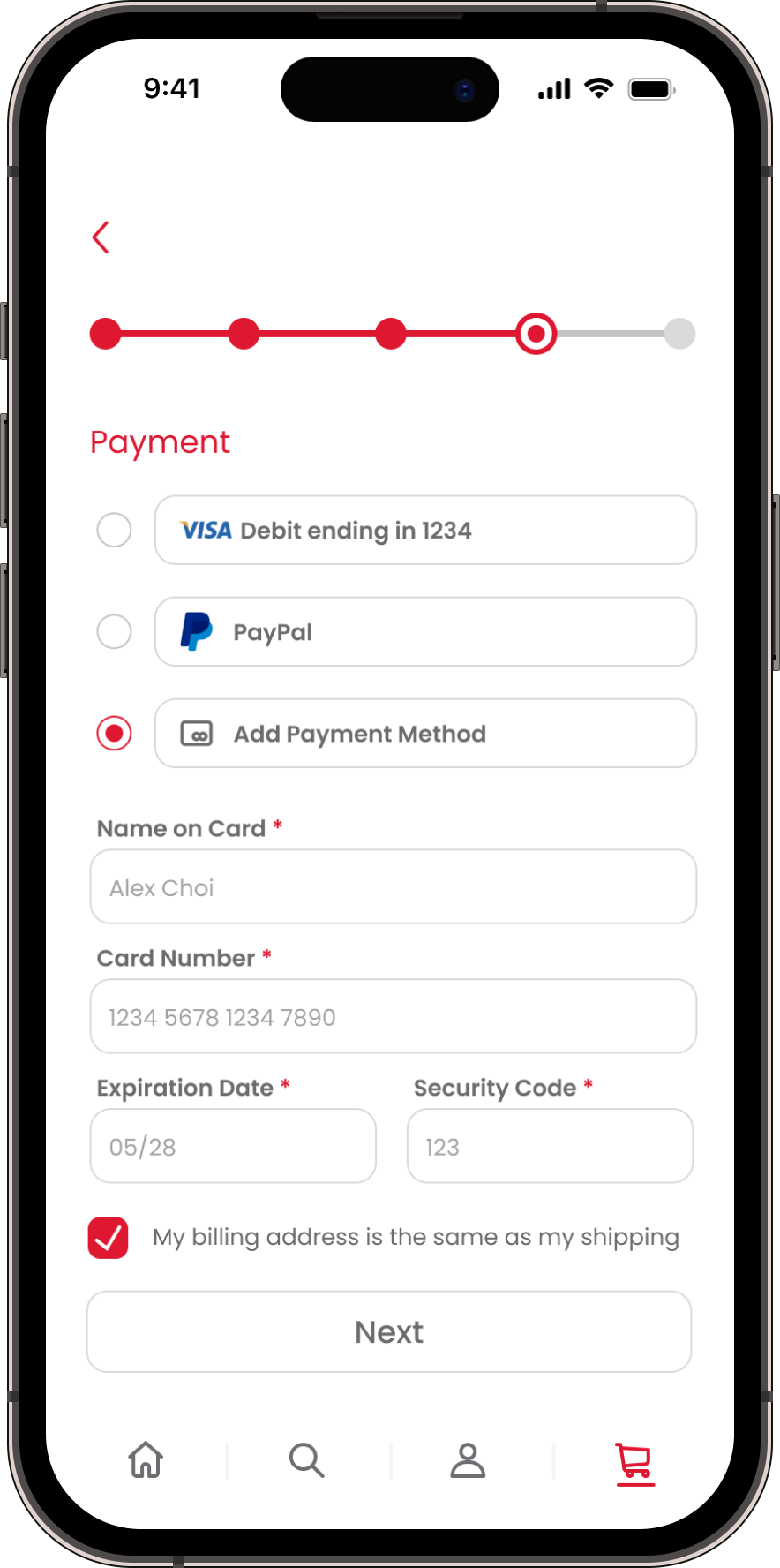
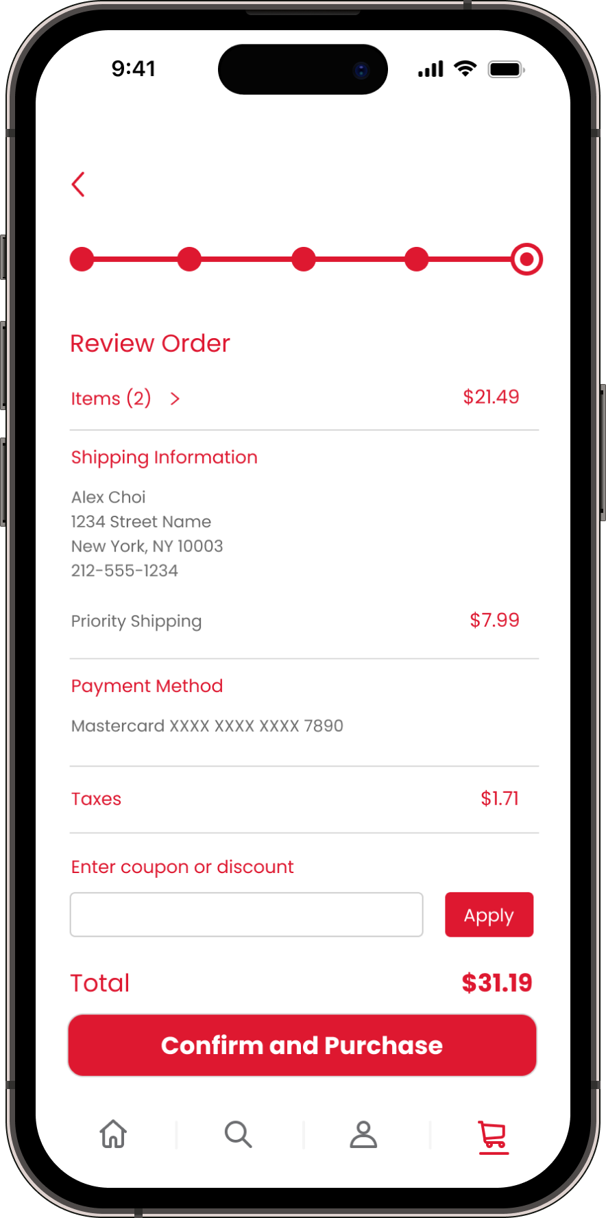
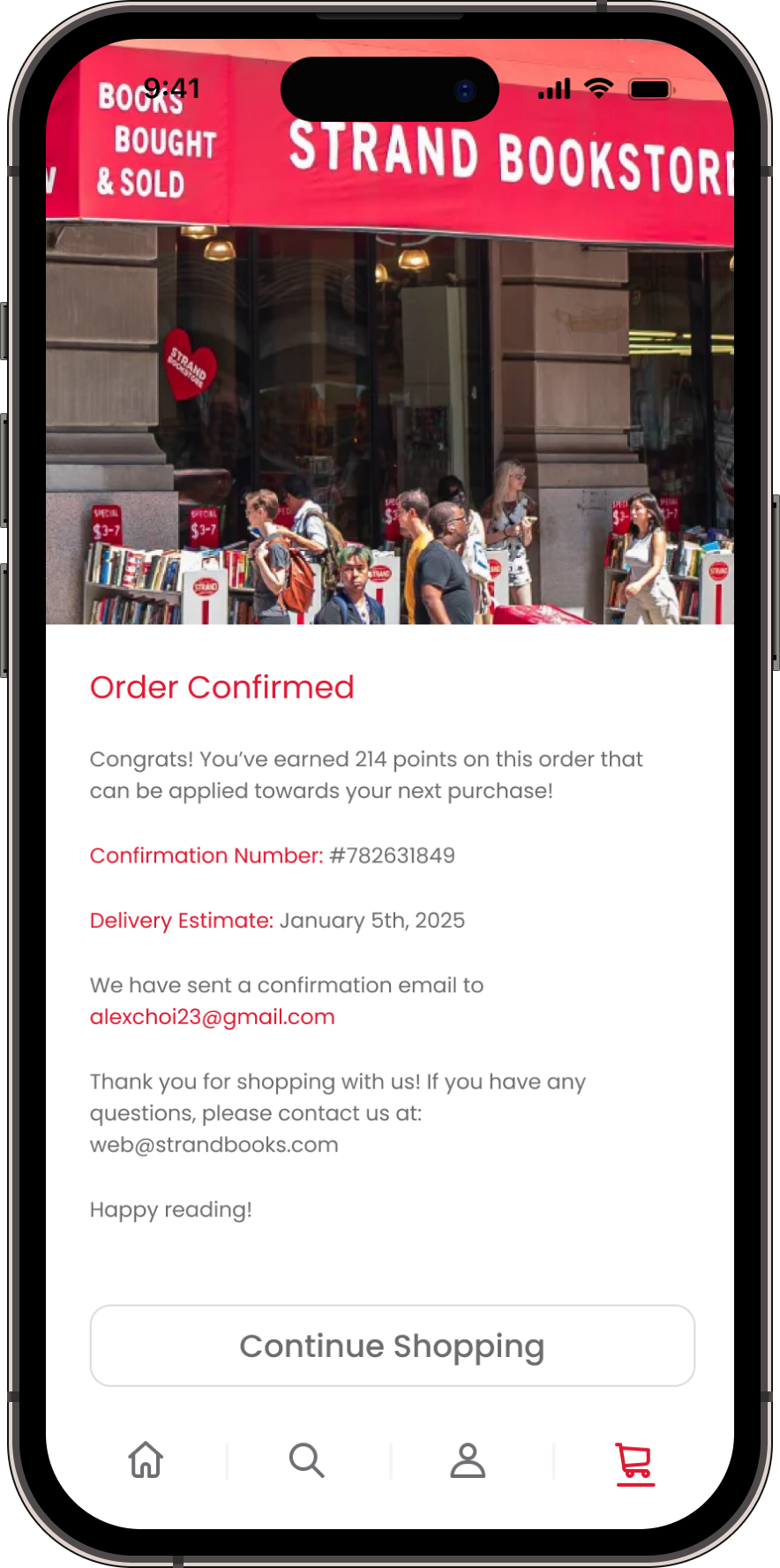
Development: Checkout
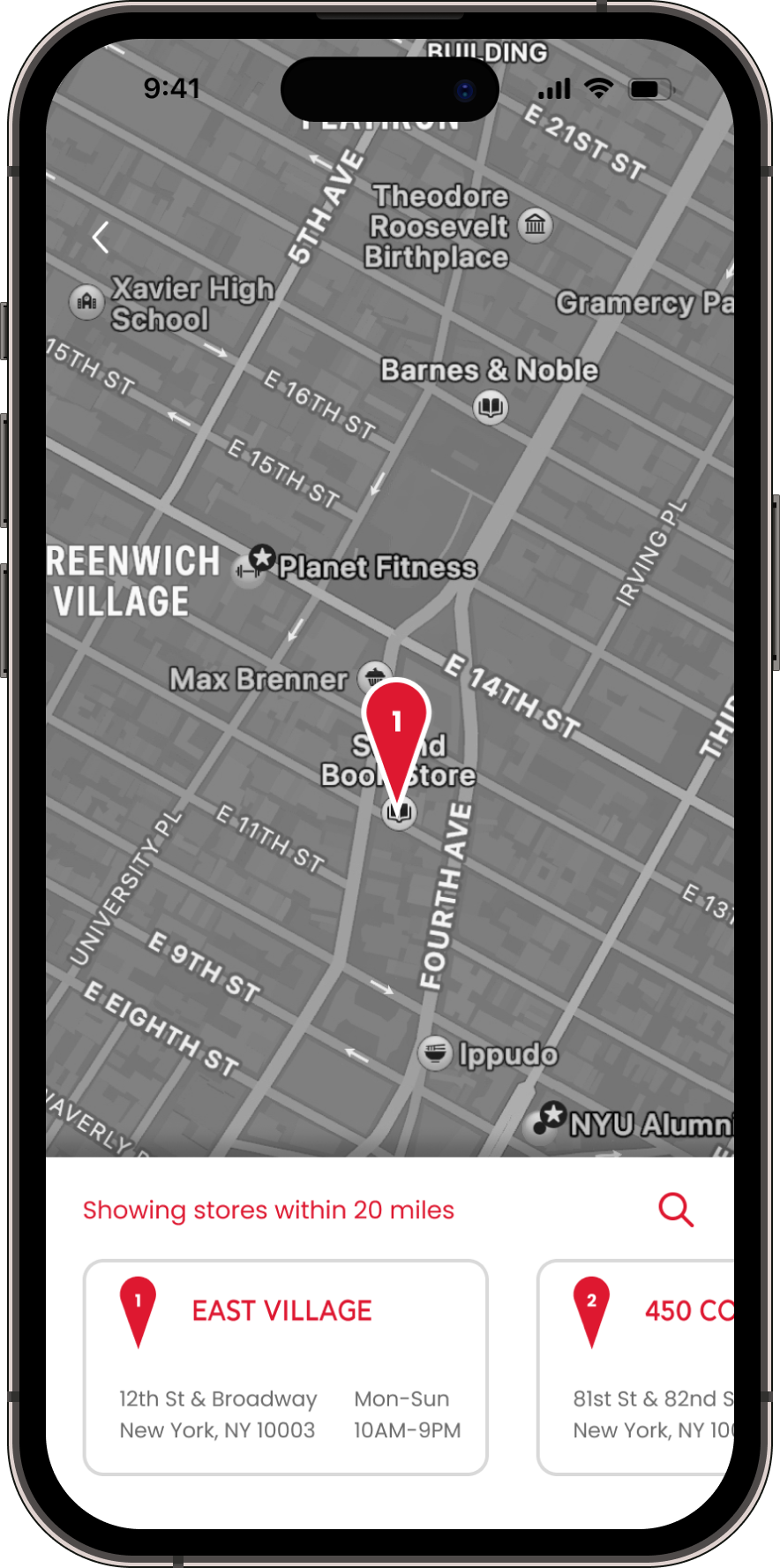
I tried to make the checkout as seamless and quick as possible, with minimal clicks and a clear progress bar. I also included a map feature for users to locate their nearest store in case they want to do an in-store pick up order.
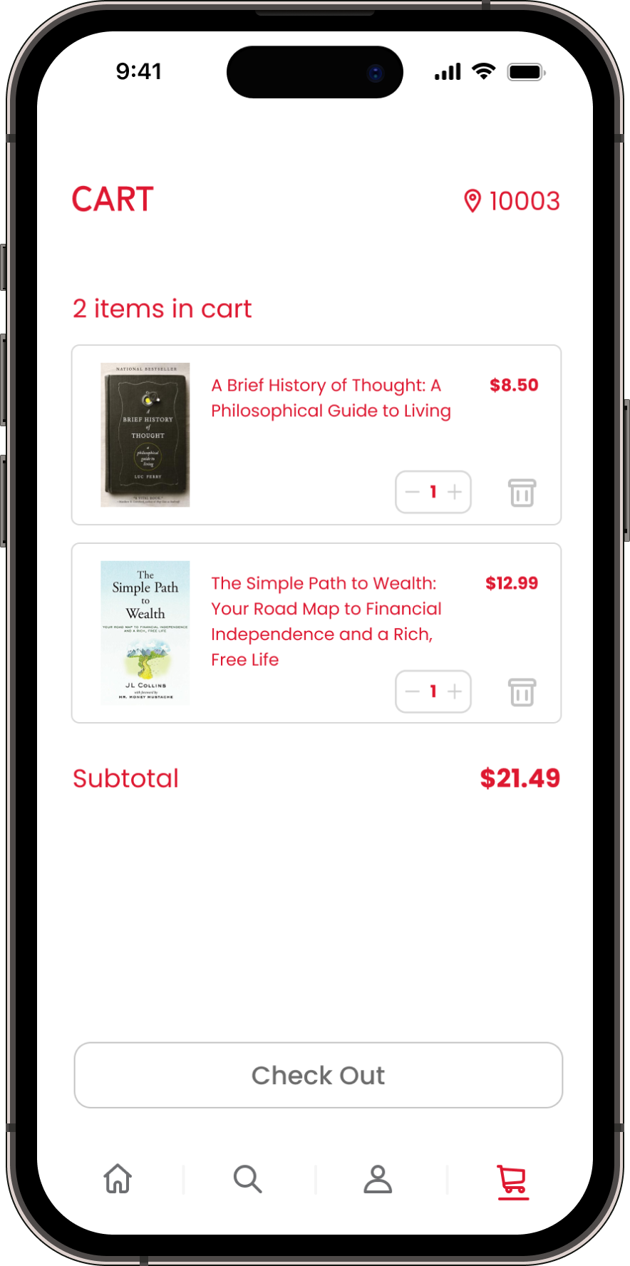
Development: Functional Add to Cart Button
Time to play with variables! I made an inventory selector when adding an item to your cart. At first I had the issue where it let you add negative items to cart, but I fixed this by making a conditional statement.
From Concept to Creation
Hi-Fidelity Prototype:
Some of the other features I implemented in the hi-fi prototype include:
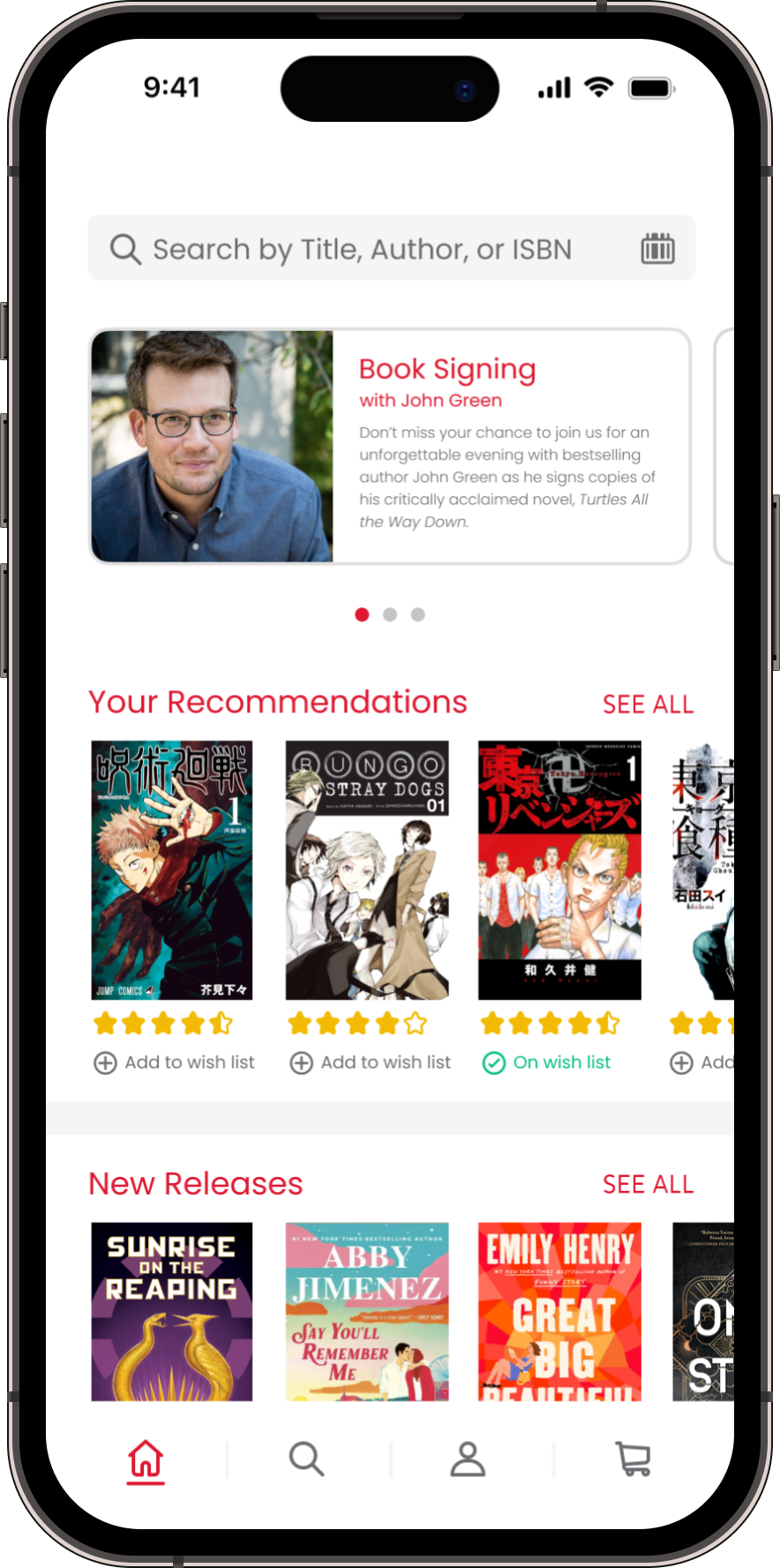
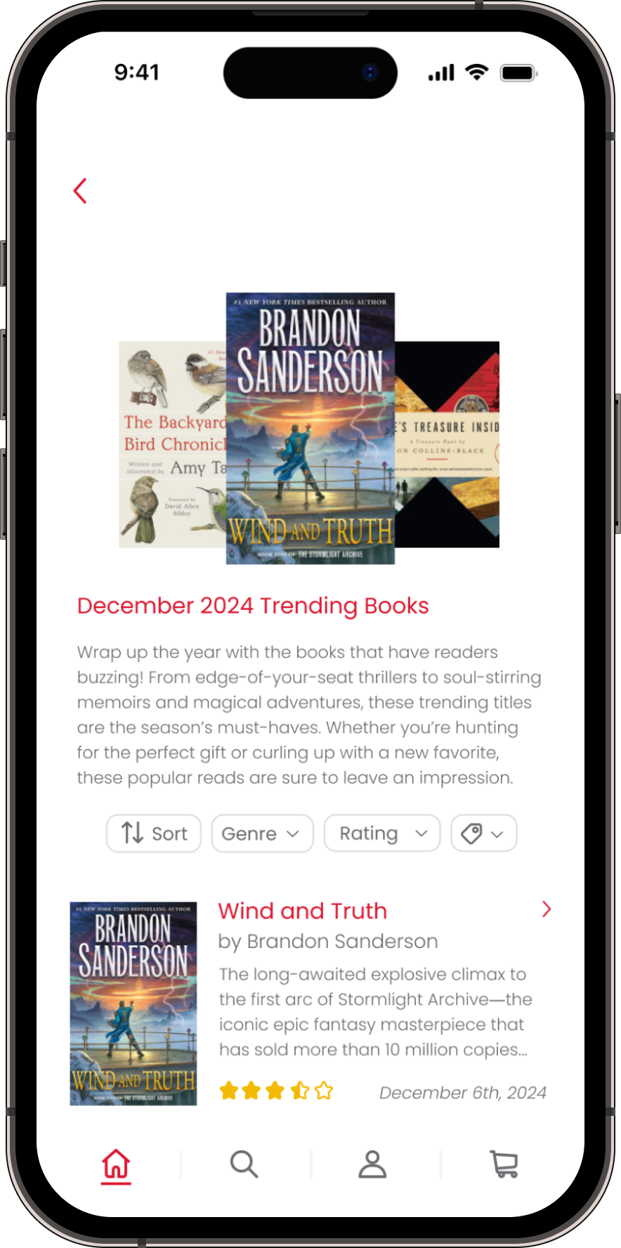
Carousel of Announcements: A small carousel at the top of the homepage that displays important notices, such as book signings, sales, and coupons
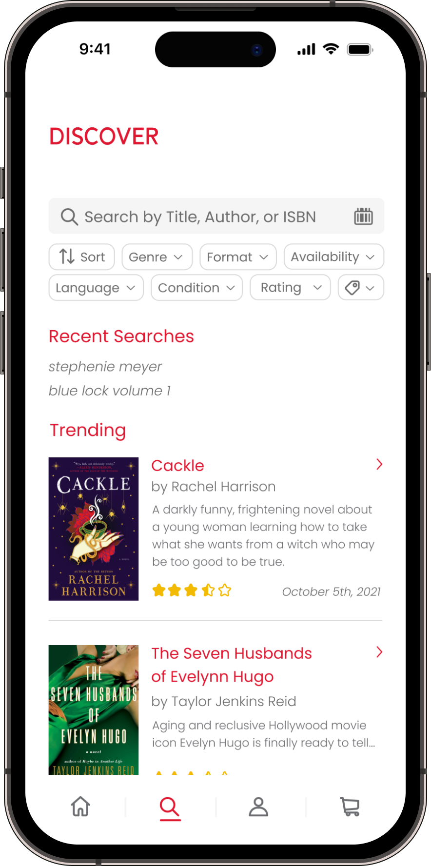
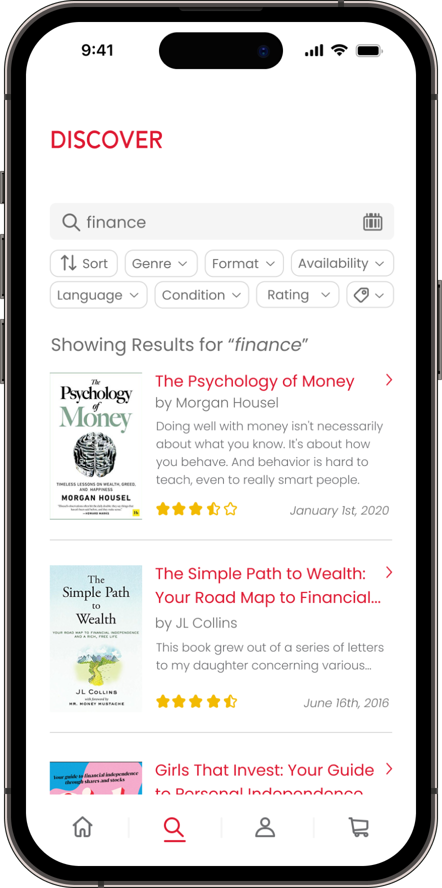
Filter/Sorting: A sort button, and filter options such as Genre, Format, Availability, Language, Condition, Rating, and Price
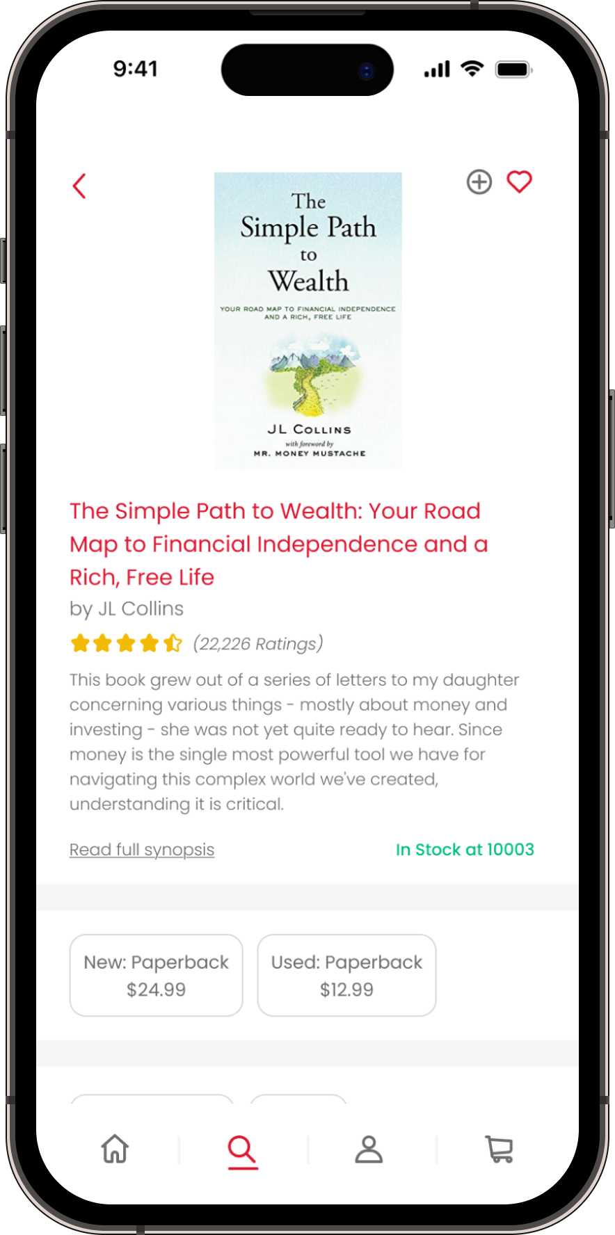
Homepage: Your Recommendations, New Releases, Trending Books, Apparel & Gifts, and Rare & Collectibles
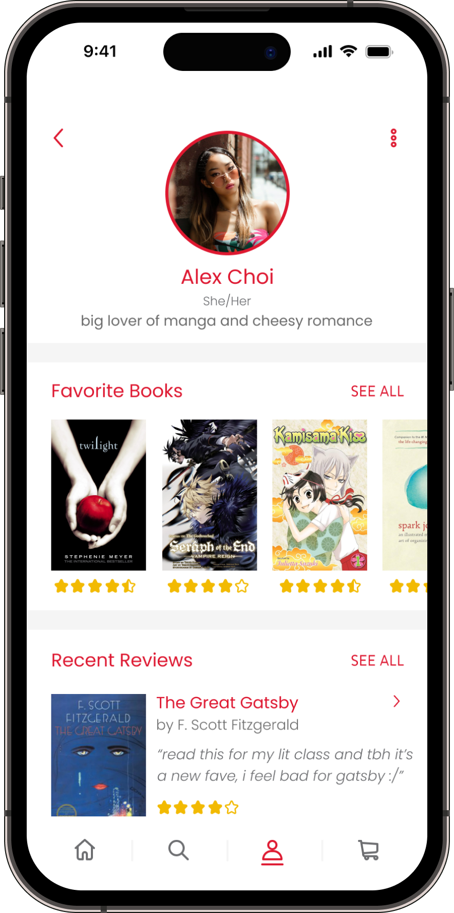
Profile: Favorite Books, Recent Reviews, Reading Lists, and Wishlist
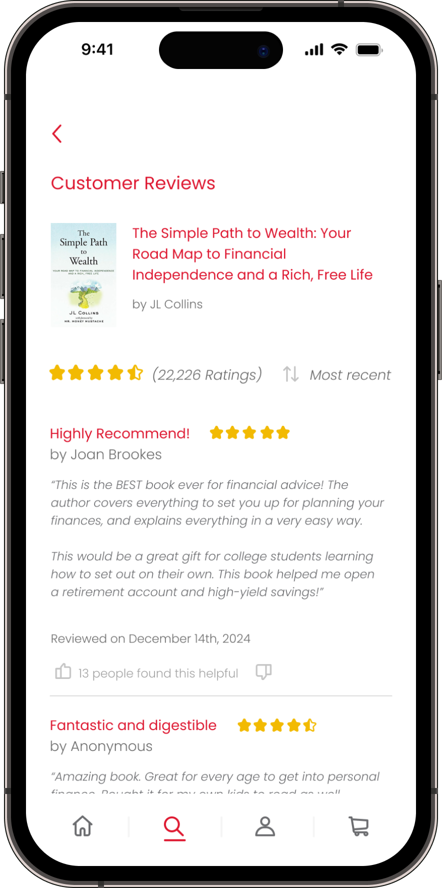
Ratings: Clear ratings on products with the ability to thumbs up or thumbs down the review and check out other people’s profiles
Account: Hosts profile, contact us, and settings such as Order History, Payment Methods, Event Management, Accessibility, etc.
User Testing
After completing the high-fidelity prototype, I conducted a usability test with a user to gather real feedback.
The user, Joe, navigated through the app prototype and left some very appreciated feedback:
“The aesthetic was very appealing and felt on brand.”
“The labels and buttons were clear and I knew what to do next”
“I found the descriptions promotions and recommendations very useful and informative.”
“My favorite part is the QR code reader.”
One critique Joe had was:
“I would recommend including a section that tells users what books are on sale.”
For some reason, a sale section had completely slipped my mind when designing the app, so I’m really glad he pointed it out. If I were to add it to the prototype, I would add it to the homepage with the other featured lists of books.
“I feel that the features feel very personable and provide a pleasant user experience. I would be more likely to shop with The Strand if the app was live, and use this app regularly because it’s easy to use.”

Conclusion
I really like the way the app turned out and believe it could genuinely help The Strand with business were it to be an actual app. It looks similar to an app like Barnes & Noble, while still being unique and having a seamless user flow experience.
Challenges I Encountered
creating interactive filter/sorting systems. I think I would like to practice this on a website prototype before doing it on a mobile app where everything is more cramped.
incorporating every feature the website, and my value proposition, had to offer into the app. I decided to simplify it and only include the most useful features that users would look for.
doing an overlay after you add an item to cart. I couldn’t get it to work properly so I decided to just not include it in the project.
Key Takeaways
Initially I wanted to include a “sell your books” feature in the app, however, it is hard to do so virtually since the used items (books, CDs, etc.) need to be judged in person to evaluate their condition and resell value.
If more independent and niche companies invested in a mobile application to help their business, they would probably see increased profits and user bases.
Anticipated Results
Since this app is not live, here are some results I’d kept in mind and had hoped to see while designing this project:
increase in The Strand sales
increase in The Strand loyalty (via repeat purchases, membership sign ups, etc.)
increase in live event turnouts (since they are promoted within the app)
frustration-free checkout process
reduction of overwhelming traffic in-store through use of in-store pick up and quickly getting your item
What Would I Do Different?
In the future, I would like to add in a hi-fi prototype of the checkout process for an in-store pick up purchase. I think before adding that I would need to get more comfortable with variables in Figma to ensure the prototyping runs smoothly. I also would add the sale section like Joe had recommended.
Below, please see the clickable prototype, a video of my hi-fi mockup walkthrough, as well as images of each page of the app.