


Sage: A Fintech App for Promoting Inclusive Financial Education 💸🎓
Mobile app prototype designed for “Finovate Hacks 2024” hackathon. Winner of “Best Business Idea” award.
Methods: Competitive Analysis, Research/Pain Points, User Flow, Wireframing, Visual Design, Prototyping
Role: Sole UX/UI Designer
Project Type: Hackathon
Duration: 1 week (12/15/24 - 12/22/24)
Tools: Figma, Google Suite, Stock Images, ChatGPT
Background
The goal of the Finovate Hacks hackathon was to apply coding or financial knowledge to develop innovative solutions that address challenges in the financial industry. Participants could build projects such as applications, tools, or platforms that contribute to areas like personal finance, financial literacy, or investment technology. I decided to take the route of a no-code project that focuses on inclusive financial education, targeting LGBTQ+ individuals and women.
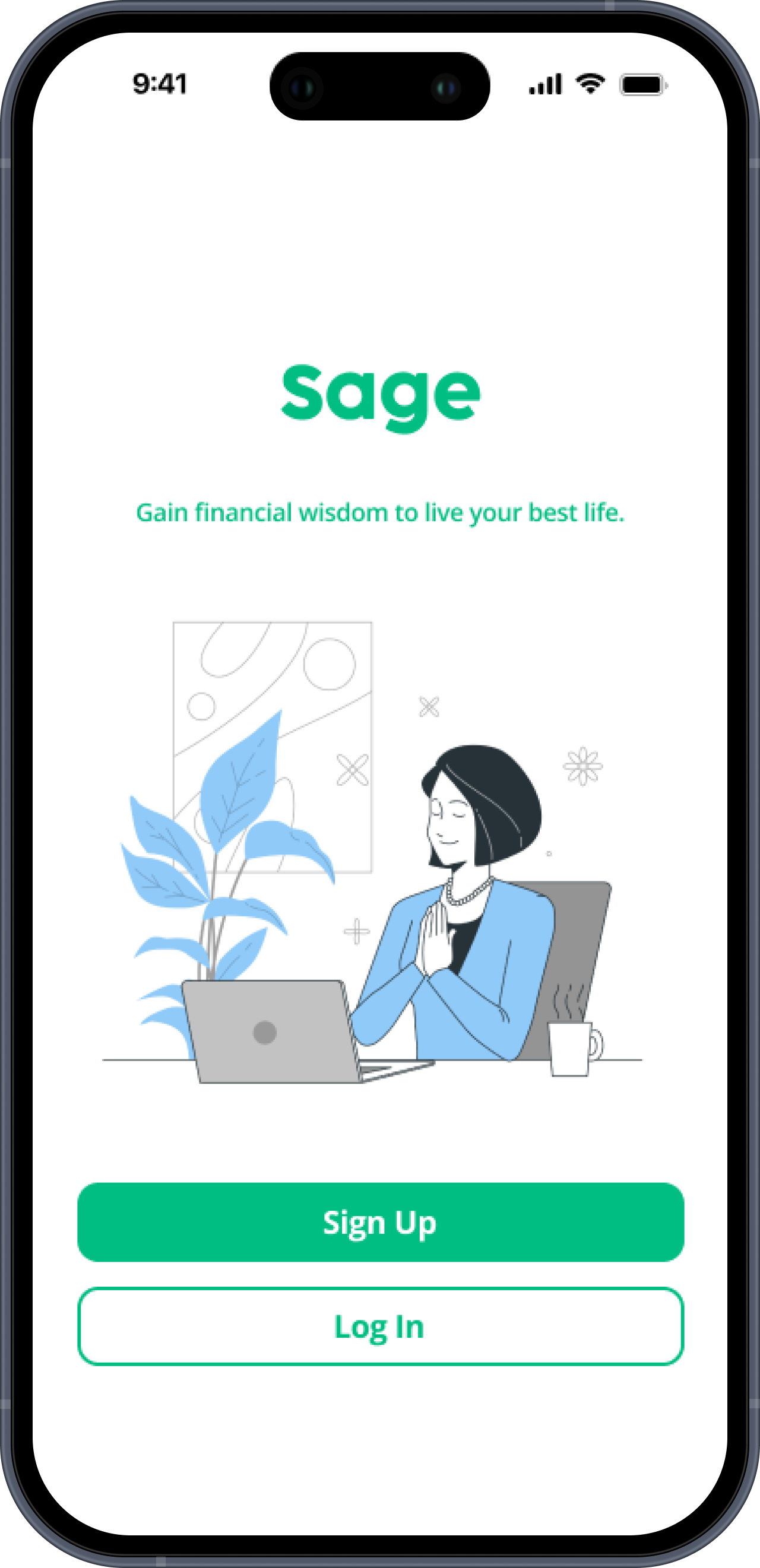
I chose “Sage” as the app name since it represents wisdom, which in this case, users will be gaining financial wisdom in their literacy journey.
Since the timespan for this hackathon was only 1 week, I focused more on the UI/visual aspects of this app rather than the user research.


Let’s Tackle a Financial Barrier!
The objective of the hackathon was to harness artificial intelligence, computer science, or STEM to create cutting-edge solutions that tackle financial challenges. The project could take the form of a website, app, tool, or platform, showcasing your creativity and innovation in the fintech space.
For the "no-code" category, which I participated in, you had to submit a fully developed idea or business plan without any technical build.
Problem
Women and queer people often lack financial knowledge, or access to obtaining it. They both have unique financial challenges that may be hard to find resources for.
Goal
I aimed to design a financial education app by:
focusing on visual design based on the problem statement, since the hackathon timeline leaves little room for the user research that would typically go into a project
basing my app around successful educational apps such as Duolingo and Zogo
using enticing colors/branding choices
focusing on ensuring the app delivered on inclusivity and offering unique features that sets it apart
creating accessibility, ensuring the app is usable by a diverse audience
What Are Duolingo, Your Juno, and Zogo Doing?
I conducted competitor analysis of other educational apps like Duolingo, Your Juno, and Zogo.
These organizations:
use bold colors
gamified elements to encourage learning
social elements like leaderboards, achievements, and forums
personalized learning paths
clear and structured information hierarchy
I wanted to incorporate these insights into the Sage app design to ensure that my app followed the structure of other successful apps, while thinking of ways to make mine stand out.
See below examples from Zogo and Your Juno.
Women and LGBTQ People Face Unique Financial Challenges
Women frequently face financial setbacks due to caregiving responsibilities, lower lifetime earnings, and inadequate retirement benefits.
LGBTQ+ individuals often pay for gender-affirming care, lose family financial support and encounter discrimination, leaving them more likely to report being financially unwell.
Based on this research, I tried to make the units and lessons in my app relevant to these unique challenges that the users might face. For example, topics like medical transitioning, maternity leave, legal protections, family planning, retirement, and employment security, could be topics that would be extremely valuable to people who identify as LGBTQ+ or women.


Intentional Aesthetic and Branding
I went with Cocogoose Pro as the font choice for the app name since it was still legible and brought a sense of fun to an educational app. I used Open Sans since it is a legible font that’s great for being informative.
I used green throughout since it represents wealth, as well as the plant Sage which represents wisdom.
Streamlining the Sage Navigation

Development
With the pain points, competitors, and user flow in mind, I developed two key user stories to guide my design decisions:
Hi-Fidelity Prototype:
I created a high-fidelity prototype using Figma. Normally, I would have created a lo-fi wireframe first, but given the timeframe of this hackathon, I jumped right into designing the app’s hi-fi prototype. I included features such as:
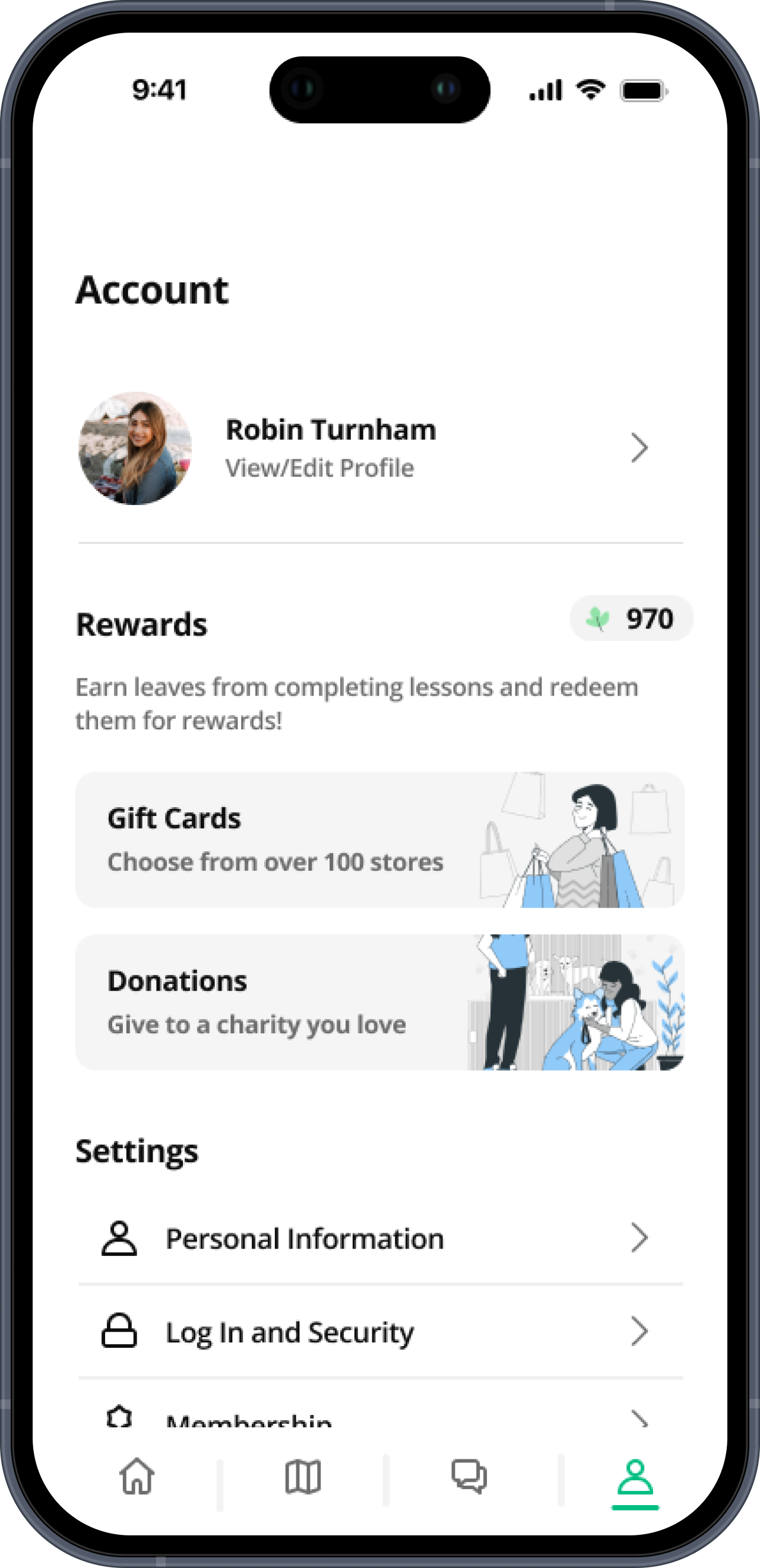
4 Pillars: Dashboard, Pathways, Community, and Account
Referral Bonus: Earn leaves by referring others
Reward Elements: From learning and using the app, user will receive “leaves”, which can then be used to redeem for gift cards or charity donations
Upcoming Events: Encourages users to attend events hosted by industry professionals with similar identities
1-on-1 Mentorships: Connect with mentors who can help user excel in any specific area of their choosing
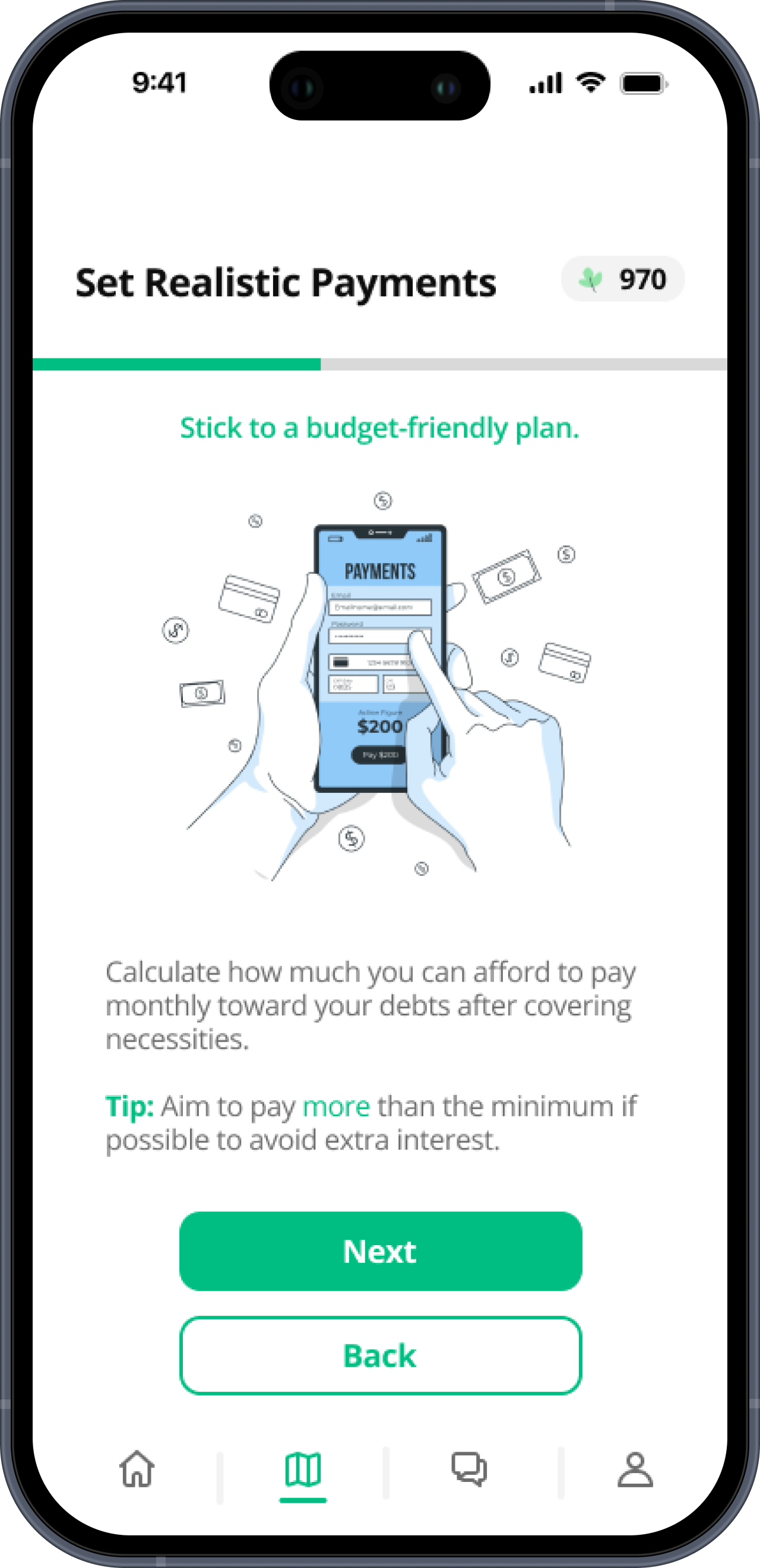
Gamified Learning: To make financial literacy compelling and digestible for users of all ages and backgrounds to consume and enjoy
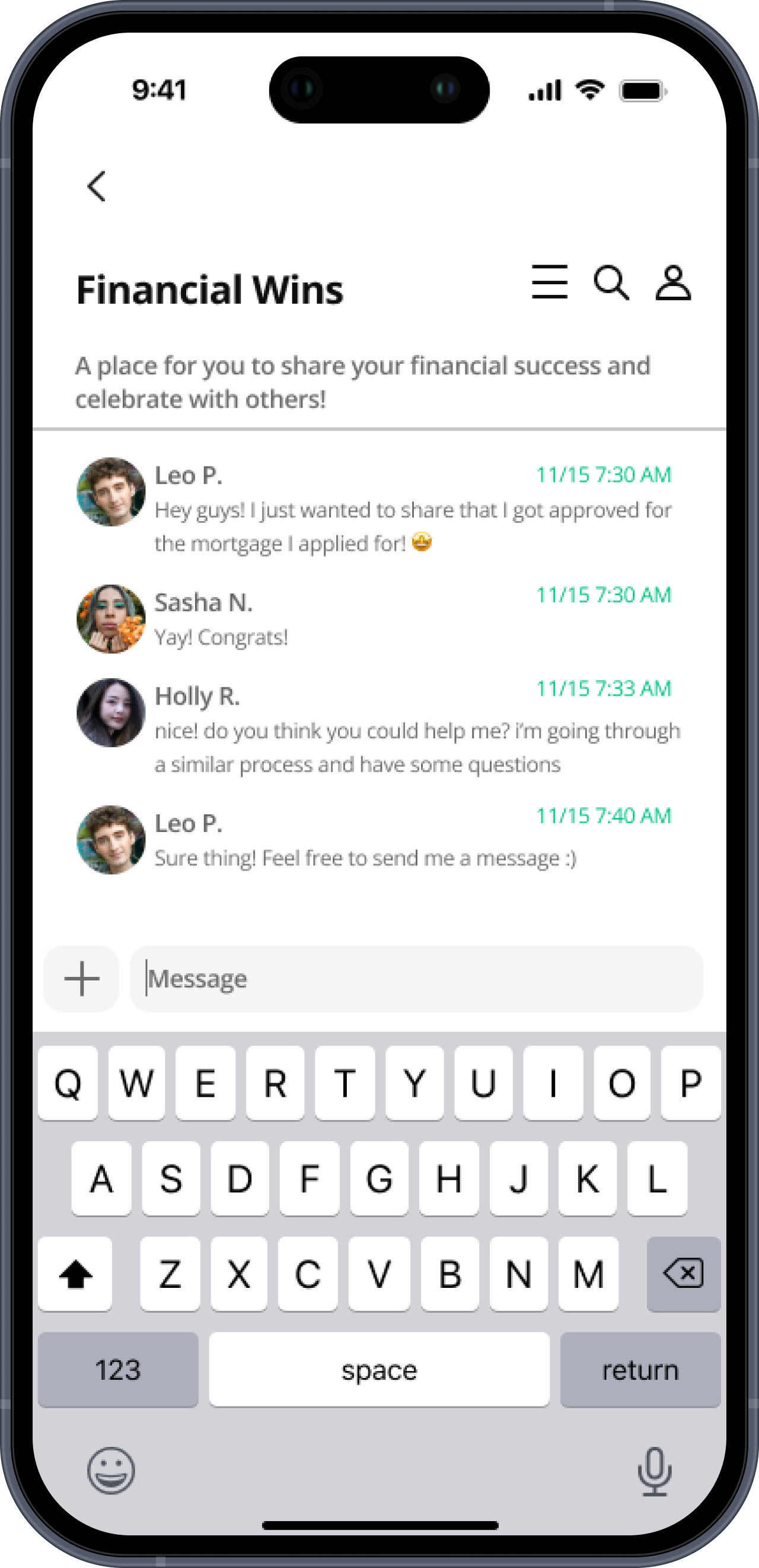
Community Building: Dedicated forums for users to interact with others going through similar situations, or to ask any relevant questions
Interactive Profile: Includes elements like recent activity, savings goals, achievements, and more to encourage showcasing personality and motivation to use the app
To-Dos: On the dashboard, so users can easily see what they can do ASAP to earn leaves
Continue Learning: Picks up on the most recent lesson user left off
End of Unit Tests: Users can test their knowledge to ensure they understand concepts presented
Over 15 Units: 15 topics and hundreds of lessons for users to explore (relevant to struggles that LGBTQ individuals and women face), while there is also an option to recommend units/topics to be added
“As a queer college student, I want to gain the knowledge and resources to become financially independent, manage my money effectively, and explore pathways to becoming a business owner.”

“As a woman in STEM, I want to enhance my financial knowledge and understand key topics like maternity leave policies and the process of home ownership.”

Conclusion
I’m very proud of how this app prototype turned out, especially given such a short time frame to work on it. I think this is one of my best designs yet, and it was something I’m very passionate about, which made me even more dedicated to the project.
So… Did I Win the Hackathon?
Yes! I was really proud of myself for winning “Best Business Idea”, considering this was my first ever hackathon, and the judges were among those who worked at companies such as Microsoft, Intuit, CVS, American Express, and Airbnb.
Challenges I Encountered
Originally, I wasn’t sure how to design the gamified lessons, which is one of the most important features of the app. I tried to mimic Duolingo’s layout with the “stepping stone” lessons, however, I liked the simplicity of Your Juno’s design more, and decided to take a more simple route with the design.
I think the prototyping also became challenging, since there were a lot of screens and buttons to work with. I messed up a few times and didn’t realize, then had to spend time going back and fixing the prototype.
Key Takeaways
Keeping the UI simple, even if you think something flashy would be cool, is usually the better option, especially in an educational app!
Doing research for this project also showed me how we can try to improve everything and make it more accessible to people in different situations. Even if you think something is generally accessible, chances are, there are always going to be certain people who are excluded, so we should aim to eliminate those chances the best we can.
Anticipated Results
Since this app is not live, here are some results I’d kept in mind and had hoped to see while designing this project:
Easier access to financial knowledge/resources
Financial empowerment for women and LGBTQ+ people
Increased financial confidence in unique situations not typically faced by the average person
Financial independence, including wealth building and asset ownership
Support system of similar identifying individuals who understand user’s struggle
What Would I Do Different?
In the future, I would love to expand on the research, dive into user testing and eventually, make the app live. I would also like to take time to make a lo-fi wireframe. Even though I worked on this project alone, if I were working with teammates, a lo-fi wireframe would be extremely helpful to anyone else on my team.
Feel free to play with the hi-fi prototype, or see a video walkthrough, as well as images of each page of the app below.

